When Soundskool approached Mäd, their brand was already quite established in the local market. But they felt that it was also time for a face-lift, not only in their logo but their brand in general.
What we had to work with.

For Soundskool, some of its visual elements - like the box enclosing the Soundskool word mark and the thinness of the current logo font - had proven to be limiting in terms of visibility, visual impact, and flexibility of use. This has affected legibility in various applications and executions.
Conversely, its yellow pantone has been well-associated with the brand and proven to be impactful. Keeping its current color palette of yellow and black was a starting point for our designers at Mäd.
Our Approach.
Before the design could start, the brand had to have a defined personality. So, our design team along with Soundskool key stakeholders voted on five words that would describe the brand at its core:
Taking these points into consideration, we explored various visual directions Soundskool could take.
Option A: Bold, Fun, Cool, Friendly & Accessible.
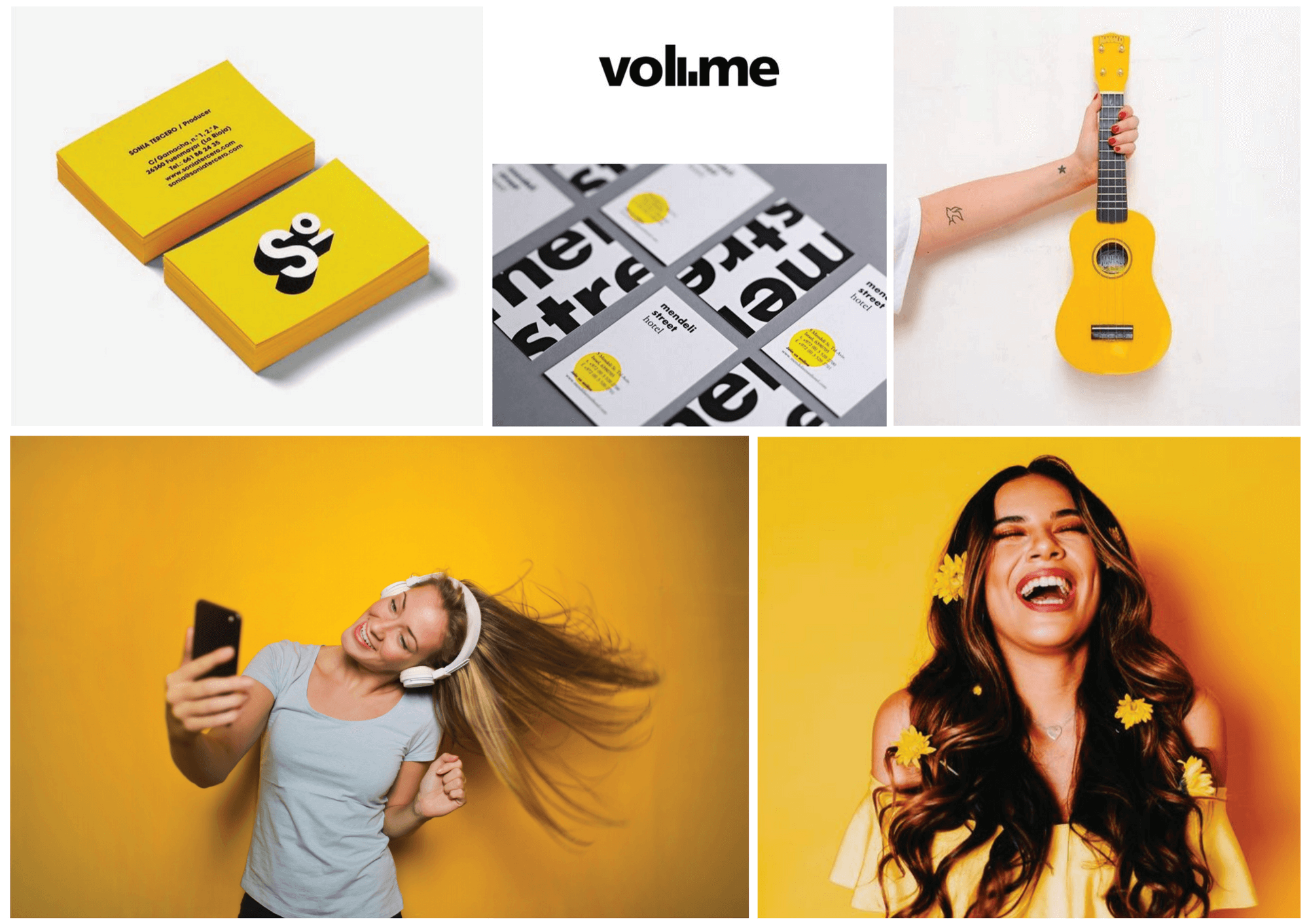
Taking inspiration from one of the main issues of the logo, Direction 1A is an expression inspired by bold typography. It’s intended to improve the logo’s visibility while retaining Soundskool’s core values of being a friendly, cool, and accessible brand. This choice of creative direction also injects a fun, fresh, and exciting tone to the brand.
Bold & Edgy, Individualistic & Different.

Direction 1B pushes the boundaries further by bringing a hint of edginess to the Soundskool brand, taking cues from ‘in your face’ executions and creating a stronger sense of individualism. While retaining the core color palette, Direction 1B would be a complete personality and tone departure from the current Soundskool brand.
Professional, Trustworthy, Elegant.

This route emphasizes the educational aspect of SoundsKool, highlighting the professionalism that customers can expect to experience with the brand. The choice of a serif typeface evokes trustworthiness and professionalism with a touch of elegance.
Khmer, Elegant & Premium.

Being a local business and taking pride in being one, this direction aims to convey this by adding touches of Khmer identity to the Soundskool brand. Direction 3 is inspired both by modern, local Khmer imagery and 60’s Khmer music.
Outside of the Box.

With Soundskool’s current logo confined in a box, this additional route embraces the box and uses it as a unique identifier. Rather than foregoing it completely, the box is re-imagined as a flexible and dynamic brand element; a sort of visual play that builds on the fun, cool, and bold values of Soundskool.
After several discussions with the Soundskool team, Direction 1 was chosen, taking specific elements from each sub-direction: From 1A, the choice of a thick font and from 1B, the contemporary, spirited and vibrant execution with a tempered edginess.
That plus a few other considerations:
Below are some of the initial logo executions and variations explored:

In the end, the client chose this logo execution:

The clever use of volume bars after the 'l' and thicker font choice best captured the spirit of the Soundskool brand. At the same time, it would address production issues of legibility and clarity.
This new identity was then used to roll out several communication items.
Brand Guideline (selected pages)


A comprehensive visual document on the proper and improper uses of the Soundskool brand's visual assets including how to use the logo with partner brands.
Magazine (selected pages)


Social Media Template samples:

Employee Look Book:

The rebranding of Soundskool achieved the strategic objectives of creating a more flexible brand that would scale, and Soundkool grew over 200% in 24 months, opening up several new locations and becoming the market leader.
Work with our expert team to transform your business and exceed objectives.
Together we can Make It Happen.™


