We have mentioned re : edge, the brilliant architectural firm behind Rose Apple Square, briefly in passing. This time, we're here with a comprehensive case study.
Not Your Average Architectural Firm. re : edge is one of the leading architectural firms behind the rise of Cambodia's jutting urban jungle. What sets them apart from other architectural firms is the emphasis that they place on human-centric design: integrating architecture, interior design, and landscape design into one holistic human experience.
To kick the project off, we collaborated with re : edge in a design sprint workshop, allowing us to fully understand their business, their goals, and their core principles.
re : edge's milestone achievement of 'A decade of design' called for rebranding, ensuring yet another decade of excellence. The brand essence of 'Innovating the future of human spaces' was crafted during the design sprint and perfectly sums up re : edge's most intrinsic purpose.
'Less is More' - Mies van der Rohe.
Re-Edge, as the company name was written before the rebranding, is a combined meaning word. Re-Edge means to 're-think, re-imagine, re-purpose, re-design, re-create, re-do or re-draw' the conventional thinking of an edge, wall, sidewalk, road, building, community, or city. Re (re :) also means 'regarding' or 'with reference to'.
We decided to combine the two mentioned concepts, rewriting the company name as re : edge, or with reference to the edge. This concept of 're :' is consistently used throughout the branding and website to introduce new ideas or sections (eg. re : principles).

All successful rebranding projects carry something from the old brand into the new, creating a sense of familiarity for the brand's clients, target audiences, and admires. The 'r' of the old logo was unique from the other logo letters in the sense that its leg descended below the baseline. To ensure a sense of familiarity, we decided that the 'r' of the new logo should also possess a unique characteristic.
Noto Sans was chosen as the basis of the logo due to its simplicity and clean appearance. The typeface was crafted ever so slightly to enhance its clean nature. The 'r' of re : edge was furthermore manipulated, creating a sharp edge that reflects the company's name and represents some of their most iconic design styles and projects.
"We are fluid. We are not about a particular style or movement. We are guided by time and space and light."
We decided to take inspiration from re : edge's fluid approach to design by creating a fluid logo. This was done by breaking the logo into two parts - 're :' and 'edge' - and applying them across the diagonal axis.

It was clear from the beginning of the project that minimalism was the ideal design direction for re : edge, allowing all focus to be placed on their work without any distraction from their branding.
A neutral color palette, with black and white as the primary colors, and generous 'white spaces' have been used to achieve this. Various shades of warm grey were added as secondary colors to allow flexibility in brand rollout design without detracting from re : edge's work and projects.
Noto Sans was chosen as the brand's only typeface due to its wide variety of font weights and styles. This not only ensures strong brand recognition, both on and offline, but also allows all written content to call back to the company's logo.

To create a memorable experience when interacting with the brand, the printing finish of blind debossing has been applied to some of the brand rollout items, allowing the brand to replicate the texture and depth found within re : edges' buildings.


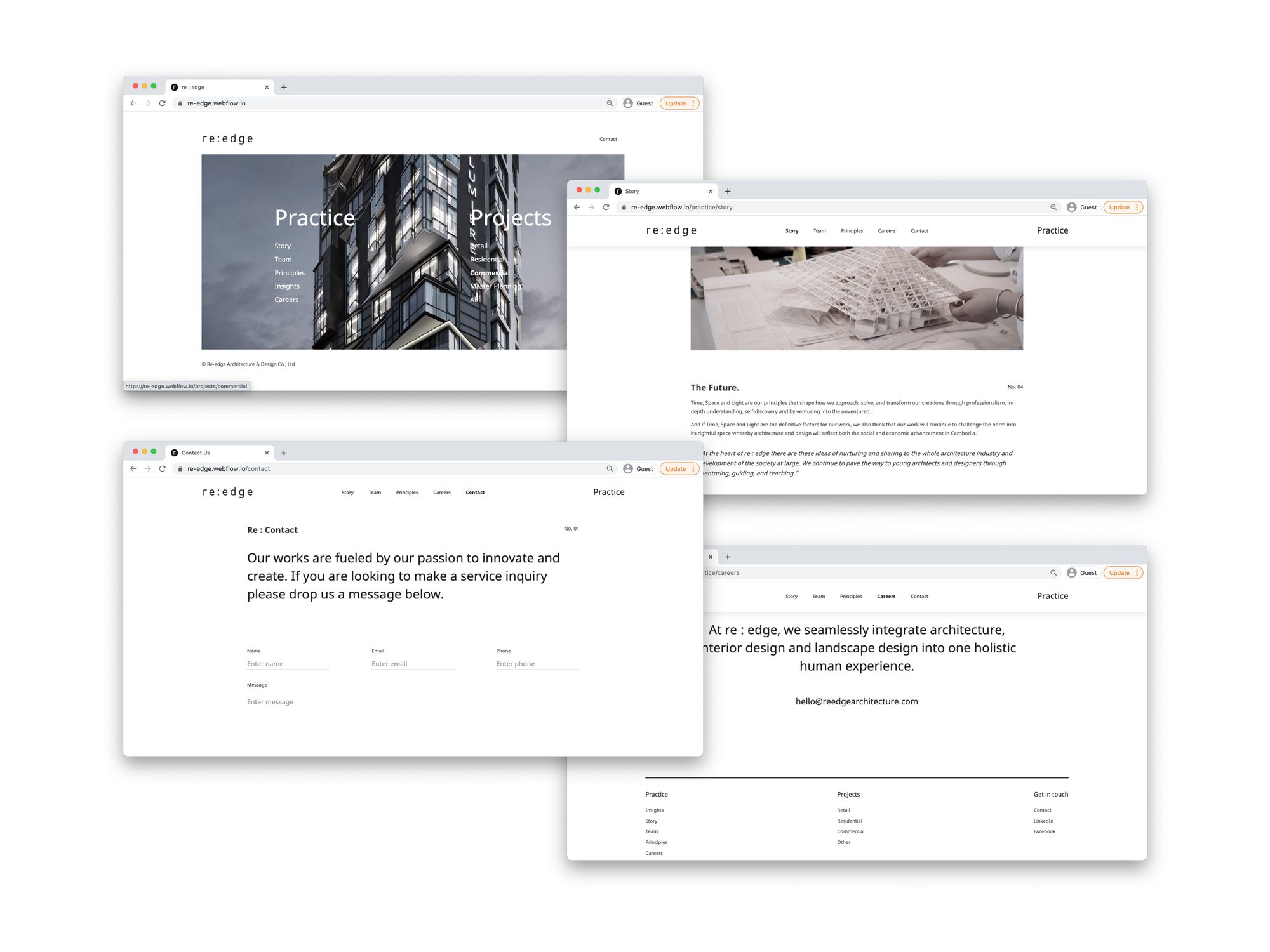
The purpose of a web presence is to translate re : edge's product offerings and visions onto the web domain. Therefore, designing with the end-users in mind, the layout must simplify the navigation process to lead users to practical information.

One of the biggest changes was the decision to have 'Practice' and 'Projects' as the two main categories.
Immediately after the user lands on the homepage, they see two columns: Practice and Projects. The divide serves to aesthetically symbolize an architectural floor plan while also keeping the website structure organized.
The categorization of Practice and Projects on the homepage effectively helps with the structure and navigation of the site. It signals to the users upfront that Practice is where you go to find out more about re : edge while Projects is where you go to access their case studies.

As a firm dedicated to enhancing the human experience, it's no doubt re : edge has many stories to share.
Story. Team. Principles. Careers. Contact. Each encompassing section in Practice is structured in a column-like appearance to maximize the storytelling effect of conveying the firm's values and culture. We meticulously incorporated interactive elements like the hover zoom image effect, animated lines, and underlines to elevate the minimal column-like appearance.
We decided that showcasing re : edge's Projects in a portfolio-like structure is the best way to exhibit their case studies.
Retail. Residential. Office. Hospitality. All. Each encompassing section in Projects is structured by mixing and matching one column and two-column layout and alternating images and text grids. We retain the harmonious look of the column-like appearance in Practice but with a slightly more magazine-like edge.

Although beautiful, the challenge with minimal designs is the risk of looking uninteresting. This is why details like interactions and micro animations are so important for capturing users' attention and engagement.
We wanted to carry the emphasis that re : edge places on 'human interaction with their spaces' over onto the web dimension. The use of micro animations throughout the website offers the users exactly this; a chance to interact as if they are navigating through the carefully curated architectural space.

Aesthetics matter. However, without quality content, a website would have no substance and lasting value. That's why we worked closely with re : edge on quality long-form content to communicate their values and ethos concisely.
As a team brimming with ideas, we wanted to share the valuable insights behind their previous work and their processes. The content had to blend seamlessly with the beautiful website design, without compromising on quality.
By examining previous website content, and having multiple deep-dive sessions with the re : edge team, our MarComms department curated humble and informative long-form copy in line with re : edge's principles.
During the copy workshops, it emerged that there were two pain points that clearer messaging could help with. Both the hiring process and the client inquiry process took longer than desired, eating up lots of time for key team members.
To solve this, we utilized conversational chat-bot features to guide inquiries through a data gathering process. This solution automated a time consuming activity and intelligently introduced a screening section for qualifying candidates and candidates that suited the business.
It's been such a pleasure working with the team at re : edge. The commonality that we share in our approach for human-centric design and simplicity has made the entire process smooth sailing.
This is not the first time that we've embraced the challenge of Designing for Designers. And it definitely won't be the last.
Work with our expert team to transform your business and exceed objectives.
Together we can Make It Happen.™


